
Provider Discovery and Comparison
Browse providers by category, then compare their plans, vendor health, churn risk, price history and alternatives before you subscribe.
These images are illustrations of the concept, not screenshots of the actual product.
Overview
Subscriber Bot is designed to help people choose new subscriptions as well as manage existing ones. This concept illustrates the provider side of the product: a discovery page for browsing providers by category, and a provider detail page for comparing plans and judging a vendor before committing to it.
Choosing a subscription usually means visiting several pricing pages, each presented differently, with little sense of how stable the vendor is, how its prices have moved or what else is available. The design puts providers into one consistent format so that category, starting price and vendor health can be compared side by side, and it keeps the alternatives in view at the moment of decision.
The Discover providers page opens with a search bar and a row of category chips covering streaming, software, AI, newsletters, insurance, fitness, utilities and finance, several of which can be selected at once. Providers appear as a grid of cards, each with a name, a category tag, a short description, a vendor health score, a starting monthly price and a View button. Opening a provider leads to a detail page with Subscribe and Compare buttons at the top. A Plans panel lists each plan with its monthly price, its features and a Select button. The right column adds a vendor health gauge with a Healthy badge and a trend indicator, a churn risk flag, a price history chart and a list of alternative providers.
Discovery feeds directly into the relationships portfolio, since subscribing to a plan is what creates a new tracked relationship. The same vendor health, price and alternatives data is what the insights and spend optimization concepts draw on when suggesting where a portfolio could change.
What this concept shows
- A provider search bar with multi-select category chips from streaming and software to insurance, utilities and finance
- Provider cards showing a category tag, short description, vendor health score and starting monthly price
- A provider detail page with Subscribe and Compare actions
- A Plans panel listing each plan's monthly price, features and a Select button
- A vendor health gauge with a Healthy badge and a trend indicator
- A churn risk flag and a price history chart for the provider
- An Alternatives list of comparable providers
How it works
- Open Providers and search, or select one or more categories to narrow the grid.
- Compare provider cards by vendor health score and starting price.
- Choose View on a provider to open its detail page.
- Review the plans with their prices and features, and check vendor health, churn risk and price history.
- Look through the alternatives or use Compare to weigh the provider against others.
- Select a plan and Subscribe to add it to the portfolio.
Who it's for
- People looking for a new streaming, software, AI or fitness subscription
- Small businesses choosing software vendors
- Procurement and IT teams evaluating vendors before purchase
- Anyone reconsidering a current provider and looking for alternatives
Illustrations
2 illustrations of this concept. Select one to view it full size.
Discover Providers by Category
This illustration shows the Discover providers page. A wide search bar sits beneath the heading, followed by a row of category chips for Streaming, SaaS, AI, Newsletters, Insurance, Fitness, Utilities and Finance, with the first three shown as selected. Below, providers are laid out as a grid of cards with generic sample names such as a streaming service, a cloud platform, an AI assistant, a daily newsletter, an insurance provider and a fitness club. Each card carries a category tag, a two-line description, a vendor health score out of one hundred, a starting price per month and a full-width View button. The consistent card format demonstrates how very different kinds of providers can be compared on the same two measures, trust and price, before opening any of them in detail. All providers and figures are sample data.
Provider Detail with Plans, Health and Alternatives
This illustration shows the provider detail page for a sample cloud platform, with a category chip under its name and Subscribe and Compare buttons on the right. A Plans panel lists three plans, each with a name, a monthly price, a billing interval label, a bulleted list of features and a Select button. The right column stacks four cards. Vendor health shows a semicircular gauge, a numeric score, a Healthy badge and a small upward trend indicator. Churn risk carries a risk flag. Price history plots the provider's price over time as a line with an area beneath it. Alternatives lists comparable providers by generic name. The design demonstrates a decision page that puts what a provider offers next to how reliable it is and what else is available, so that choosing a plan is an informed comparison rather than a leap.
Topics
- compare subscription providers
- subscription marketplace
- find SaaS alternatives
- vendor health score
- subscription price history
- compare plans and pricing
- churn risk of a vendor
- discover new subscriptions
- provider directory
Related concepts
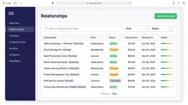
Subscription Relationships
Every subscription, membership, license and contract as one record with its plan, payment, entitlements, health and renewals.
3 illustrations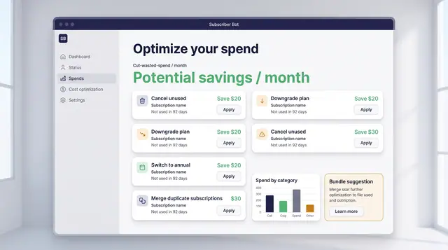
Spend Optimization and License Utilization
Turn portfolio data into decisions: cancel what is unused, downgrade what is oversized, and find the seats you are paying for twice.
2 illustrations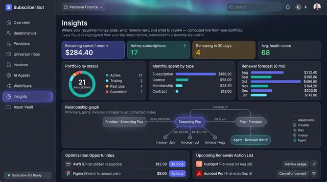
Portfolio Insights and Renewal Forecast
Recurring spend, portfolio health and the next six months of renewals, computed from your own subscriptions rather than typed in.
2 illustrations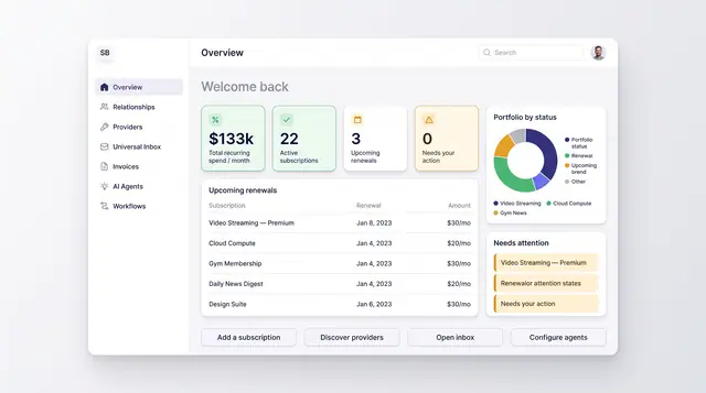
Portfolio Overview Dashboard
One home screen for recurring spend, active subscriptions, upcoming renewals and anything that needs your attention.
2 illustrations